Kayla Lee

04
Mobile Onboarding
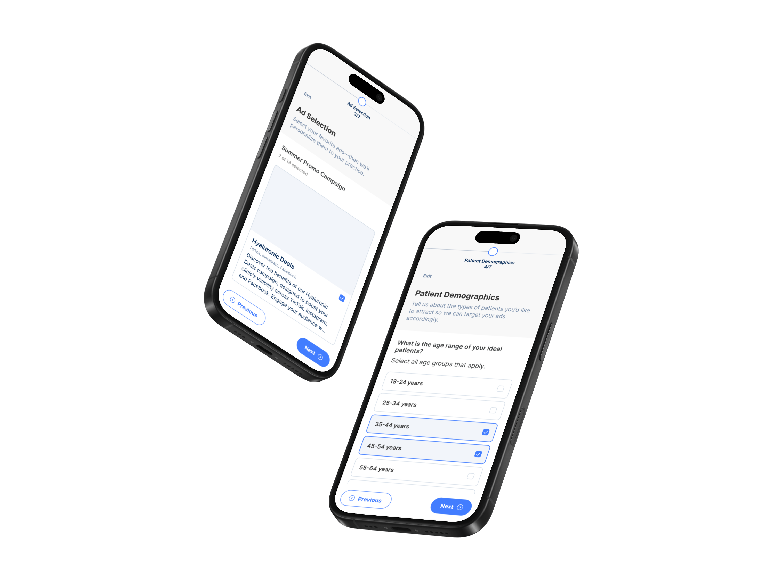
Redesigned Exfluential's mobile onboarding experience to better educate non-technical users, improve feature discoverability, and help new customers get the most value from the platform.

Reduced onboarding-related support questions

Increased engagement with onboarding content
20%
Improved onboarding completion
47%
Improved user confidence during onboarding
Company
Exfluential
Role
Product Design Lead
Timeline
2 Weeks
Platform
Desktop
Mobile
Team
Technical Program Manager, Engineering, Customer Success, QA
Tools Used
Figma, FigJam, Posthog, Jira, Slack, Zoom, Loom, Notion, Gemini, Google AI Studio
The Challenge
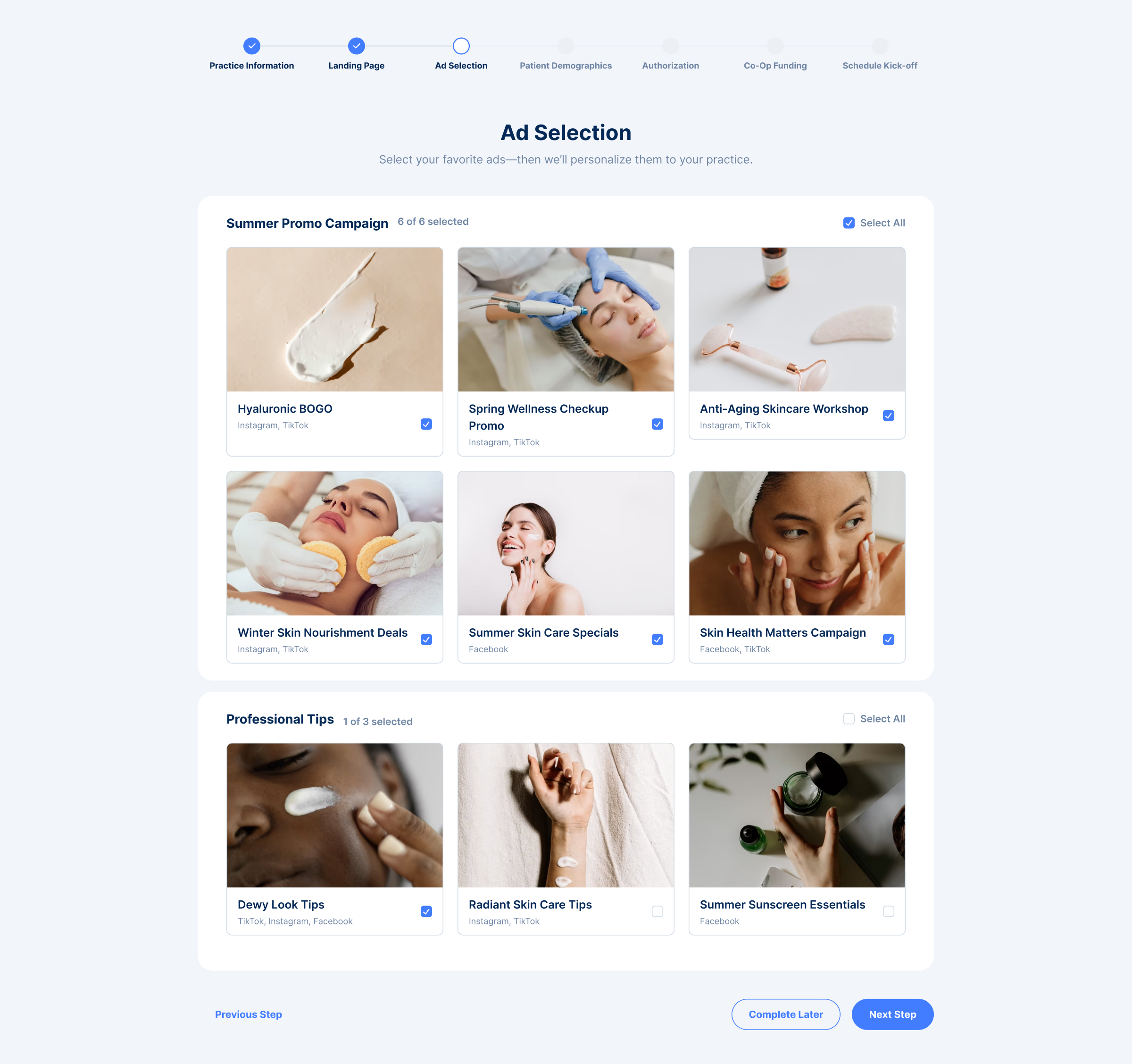
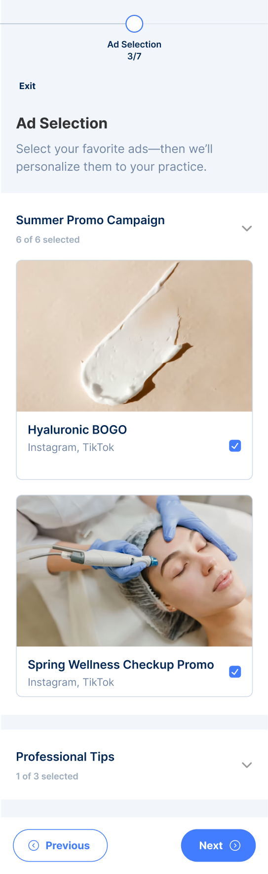
Exfluential's mobile onboarding experience was intended to help users learn the platform, but instead created additional confusion. Educational content lacked context, key functionality was missing, and important visuals—such as marketing ad examples—were limited to small thumbnails that users couldn't explore in greater detail. For a user base with varying levels of technical confidence, the experience felt incomplete and often left more questions than answers.
The Goal
Create a more comprehensive and approachable onboarding experience that helps non-technical users understand the platform, explore features confidently, and complete setup with minimal frustration.
Success Metrics

Improved onboarding completion
Improved administrator efficiency
Improved administrator efficiency

Reduced onboarding-related support questions

Research & Insights
🗂️
Incomplete Guidance
Users felt onboarding lacked enough information to confidently use the platform.
🖼️
Limited Context
Marketing examples were only viewable as small thumbnails, making them difficult to interpret.
🙋🏻
High Support Dependency
Users frequently relied on Customer Success to answer questions onboarding should have addressed.
Design Principles
📚
Educate Through Context
Provide the information users need before they become confused.
🧠
Reduce Cognitive Load
Break information into digestible steps that are easy to understand.
✨
Build User Confidence
Help users feel capable of completing tasks independently.
The Solution
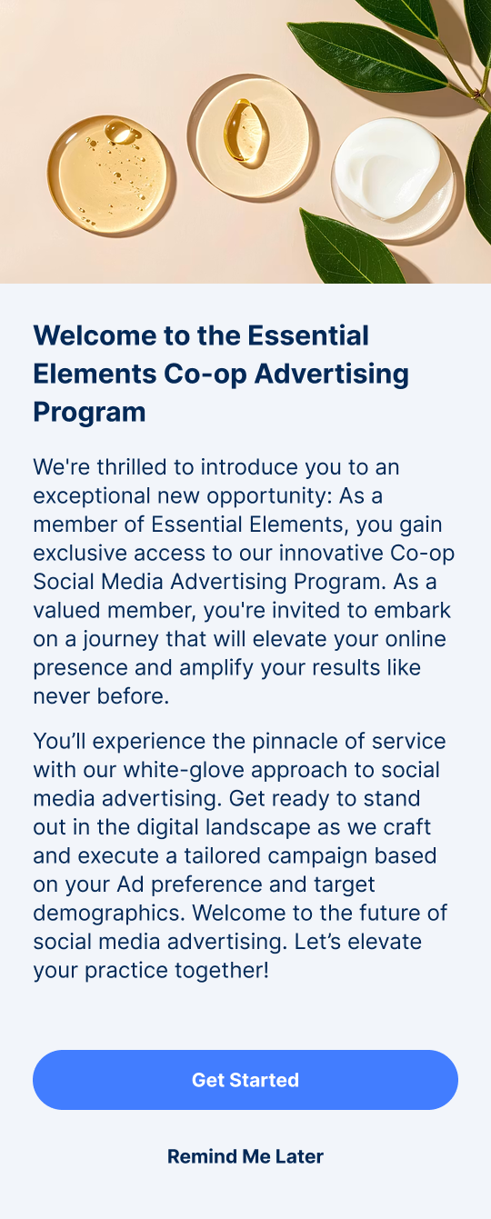
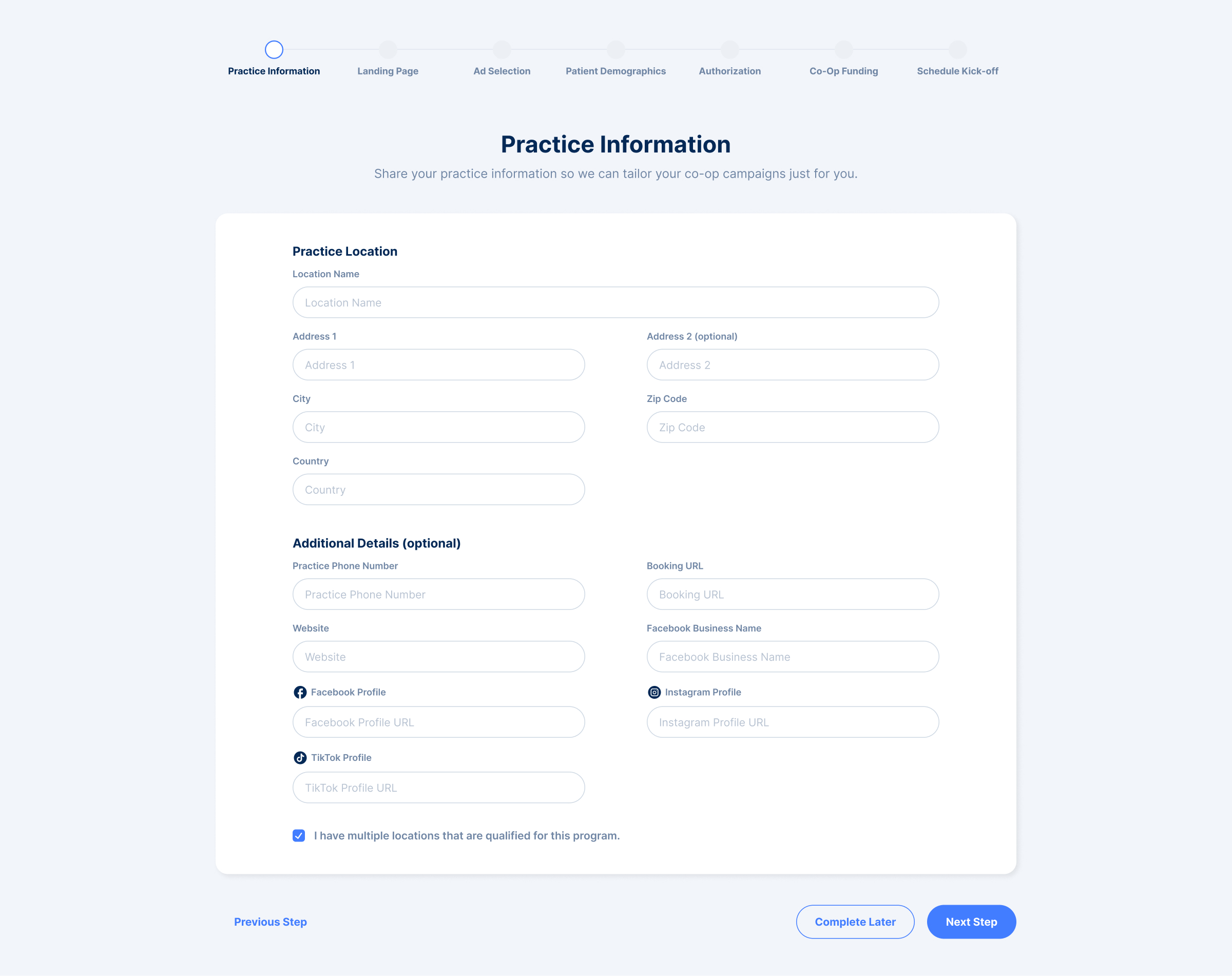
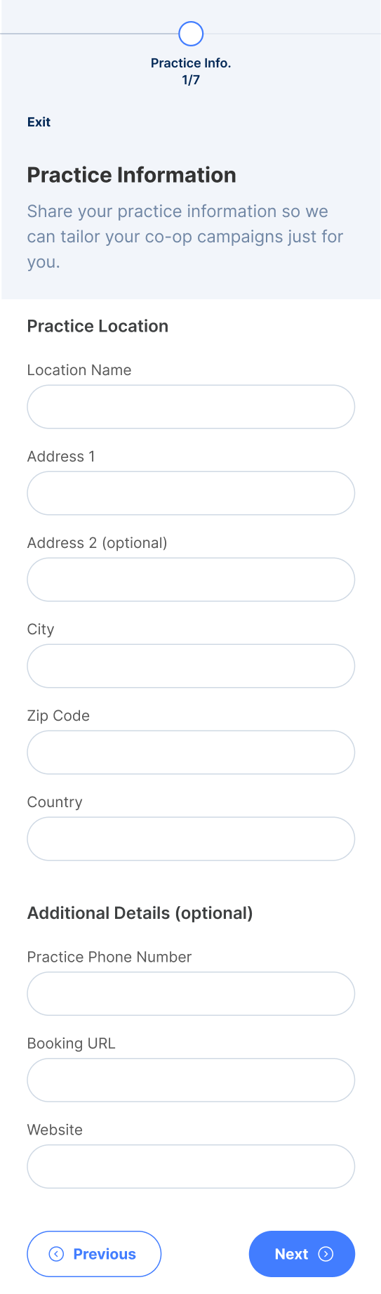
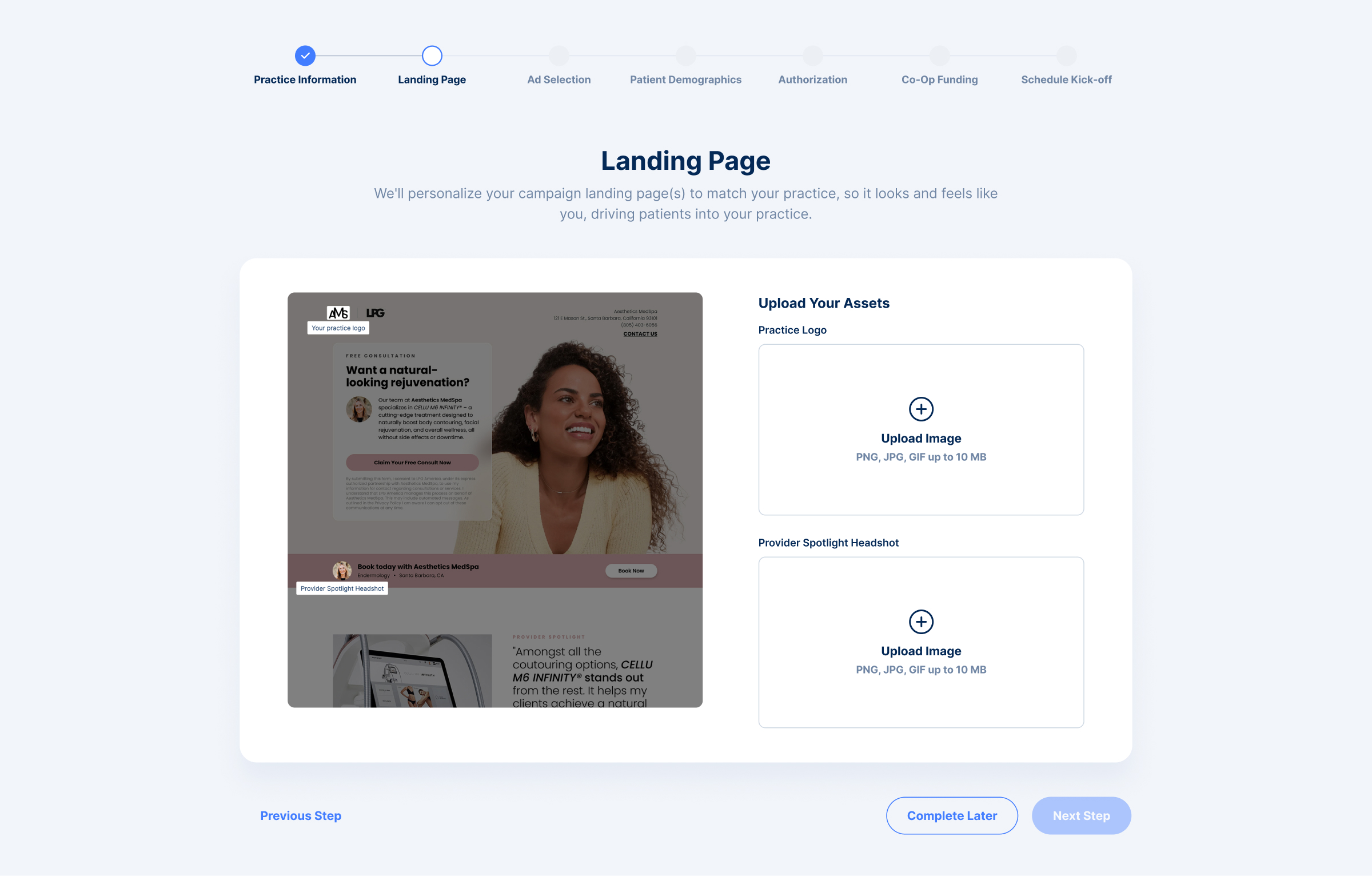
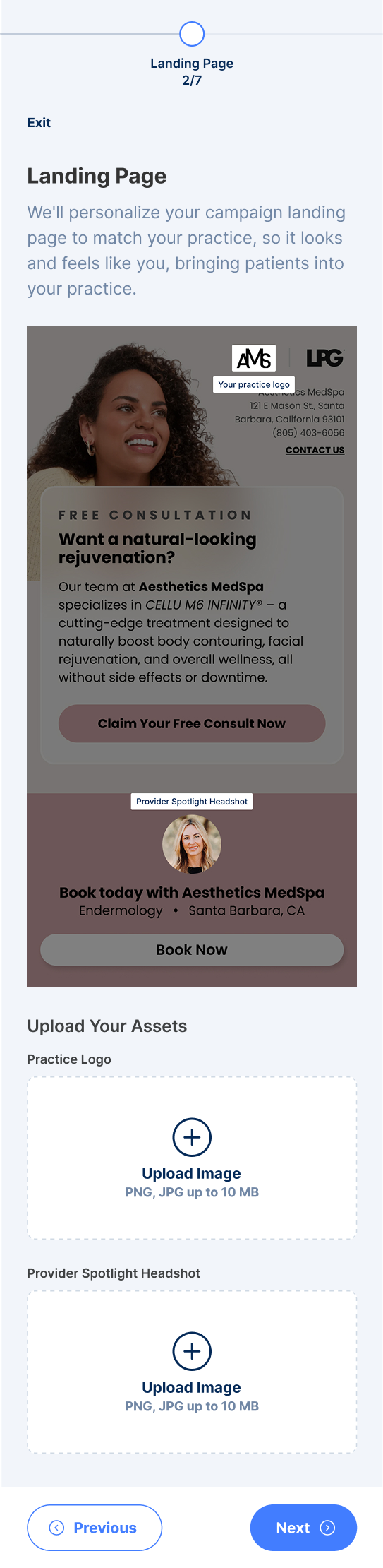
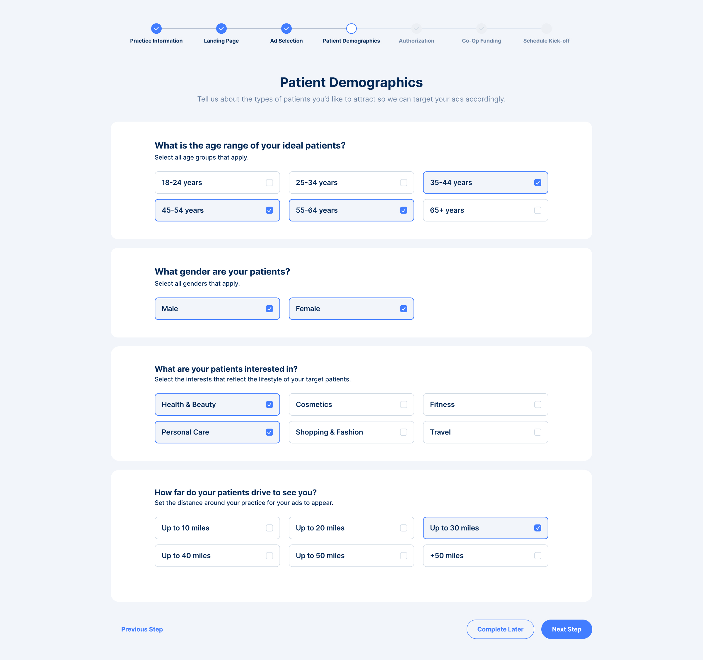
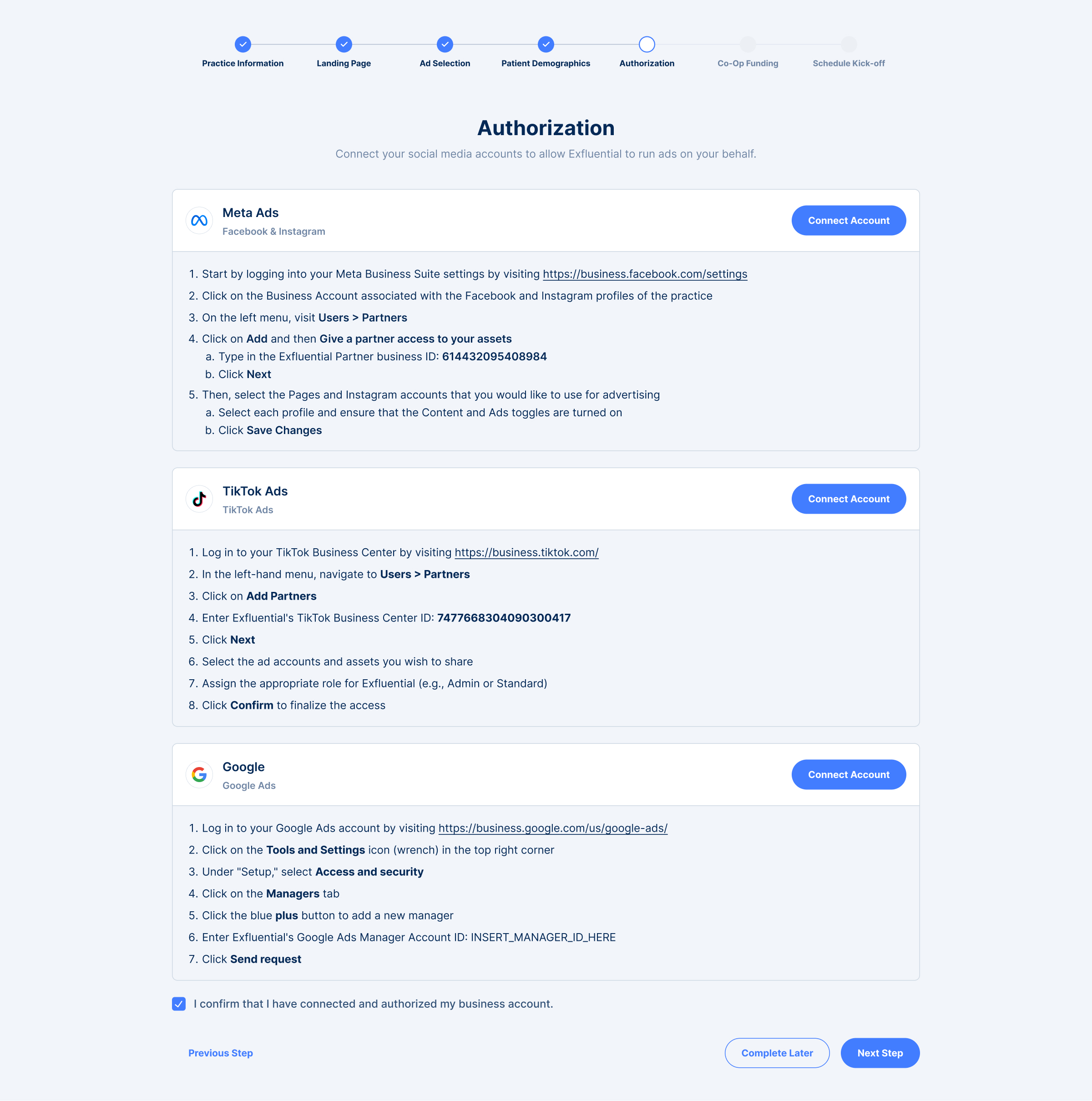
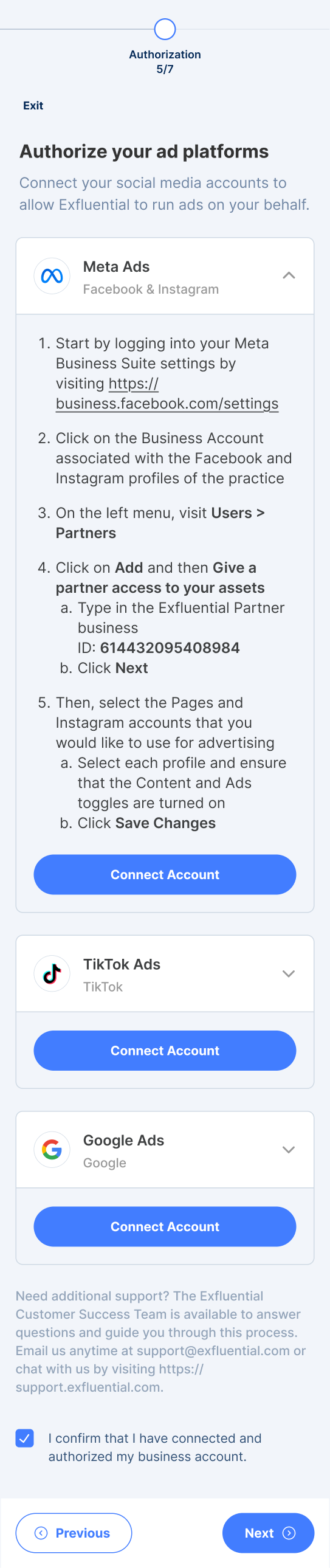
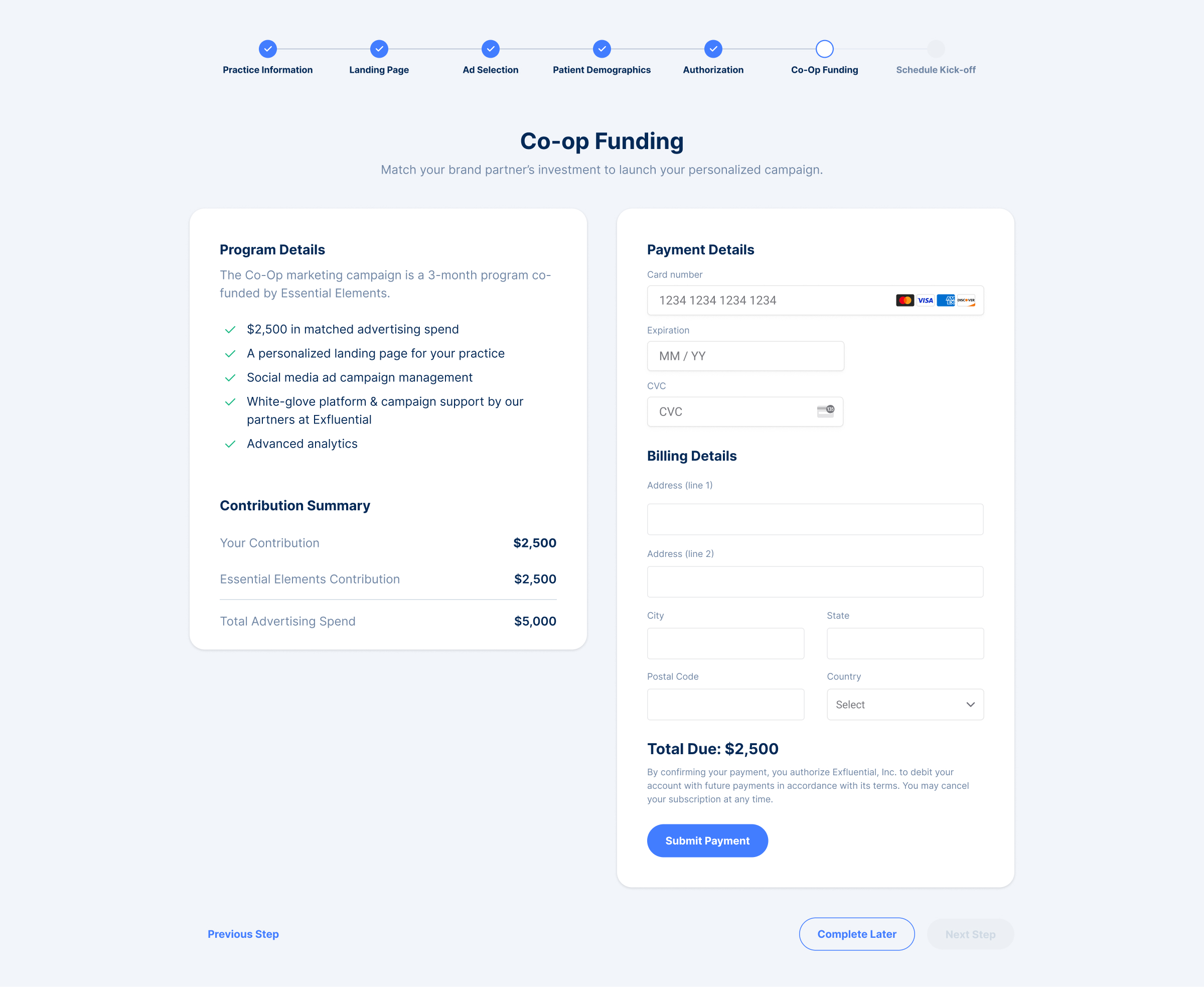
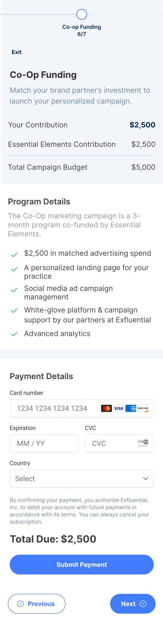
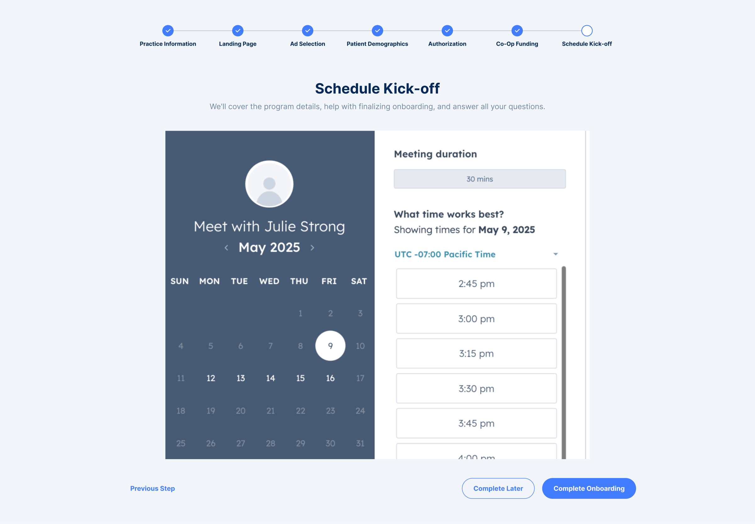
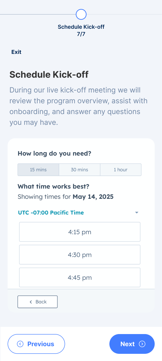
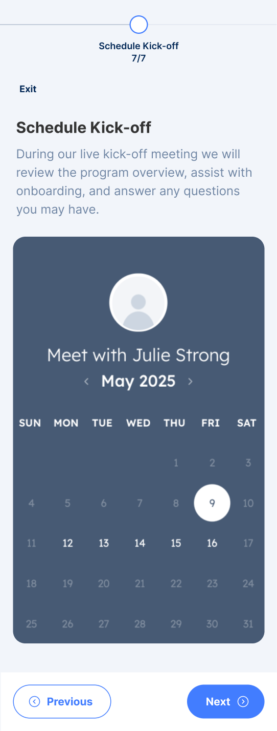
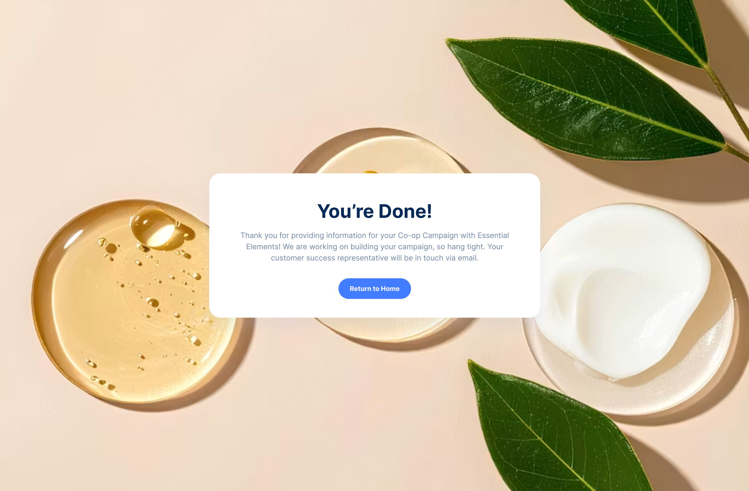
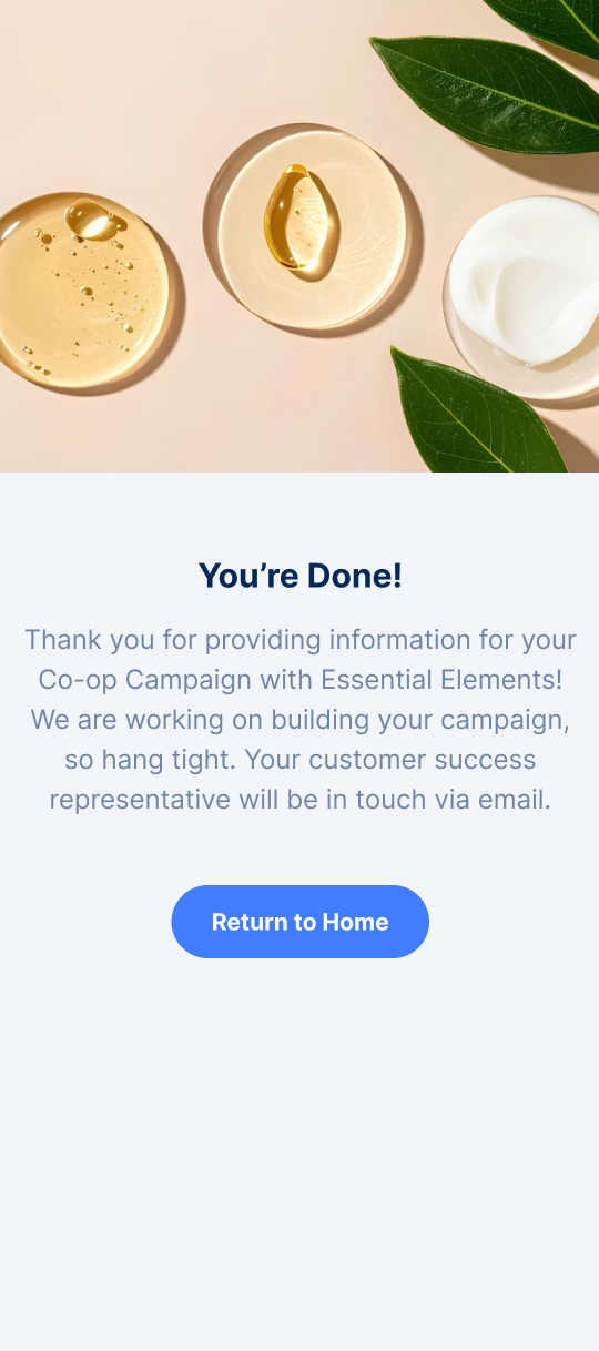
Rather than treating onboarding as a quick product tour, the redesigned experience became a guided learning journey tailored to users with limited technical experience. Educational content was expanded, visual examples became interactive through full-screen image viewing, and the overall flow was simplified to reduce cognitive load and encourage confident product adoption.
Key Improvements
+ Expanded onboarding education
+ Full-screen image previews
+ Improved visual hierarchy
+ Clearer instructional content
+ Simplified navigation
+ Better feature discoverability


Impact

Improved onboarding clarity for first-time users.
Reduced ambiguity through richer educational content.
Created a more scalable onboarding experience for future product updates.
Reduced ambiguity through richer educational content.
Created a more scalable onboarding experience for future product updates.
Created a more scalable onboarding experience for future product updates.

Previous

Welcome Emails
Next
Image Uploads

Kayla Lee
04
Mobile Onboarding
Redesigned Exfluential's mobile onboarding experience to better educate non-technical users, improve feature discoverability, and help new customers get the most value from the platform.

20%
Improved onboarding completion
47%
Improved user confidence during onboarding
Increased engagement with onboarding content

Reduced onboarding-related support questions
Company
Exfluential
Role
Product Design Lead
Timeline
2 Weeks
Platform
Desktop
Mobile
Team
Technical Program Manager, Engineering, Customer Success, QA
Tools Used
Figma, FigJam, Posthog, Jira, Slack, Zoom, Loom, Notion, Gemini, Google AI Studio
The Challenge
Exfluential's mobile onboarding experience was intended to help users learn the platform, but instead created additional confusion. Educational content lacked context, key functionality was missing, and important visuals—such as marketing ad examples—were limited to small thumbnails that users couldn't explore in greater detail. For a user base with varying levels of technical confidence, the experience felt incomplete and often left more questions than answers.
The Goal
Create a more comprehensive and approachable onboarding experience that helps non-technical users understand the platform, explore features confidently, and complete setup with minimal frustration.
Success Metrics
Improved onboarding completion
Improved administrator efficiency
Improved administrator efficiency
Reduced onboarding-related support questions

Research & Insights
🗂️
Incomplete Guidance
Users felt onboarding lacked enough information to confidently use the platform.
🖼️
Limited Context
Marketing examples were only viewable as small thumbnails, making them difficult to interpret.
🙋🏻
High Support Dependency
Users frequently relied on Customer Success to answer questions onboarding should have addressed.
Design Principles
📚
Educate Through Context
Provide the information users need before they become confused.
🧠
Reduce Cognitive Load
Break information into digestible steps that are easy to understand.
✨
Build User Confidence
Help users feel capable of completing tasks independently.
The Solution
Rather than treating onboarding as a quick product tour, the redesigned experience became a guided learning journey tailored to users with limited technical experience. Educational content was expanded, visual examples became interactive through full-screen image viewing, and the overall flow was simplified to reduce cognitive load and encourage confident product adoption.
Key Improvements
+ Expanded onboarding education
+ Full-screen image previews
+ Improved visual hierarchy
+ Clearer instructional content
+ Simplified navigation
+ Better feature discoverability
Impact
Improved onboarding clarity for first-time users.
Reduced ambiguity through richer educational content.
Created a more scalable onboarding experience for future product updates.
Reduced ambiguity through richer educational content.
Created a more scalable onboarding experience for future product updates.
Created a more scalable onboarding experience for future product updates.

Previous
Welcome Emails
All Projects
Next
Image Uploads
Kayla Lee
04
Mobile Onboarding
Redesigned Exfluential's mobile onboarding experience to better educate non-technical users, improve feature discoverability, and help new customers get the most value from the platform.
20%
Improved onboarding completion
47%
Improved user confidence during onboarding
Increased engagement with onboarding content
Reduced onboarding-related support questions
Company
Exfluential
Role
Product Design Lead
Timeline
2 Weeks
Platform
Desktop
Mobile
Team
Technical Program Manager, Engineering, Customer Success, QA
Tools Used
Figma, FigJam, Posthog, Jira, Slack, Zoom, Loom, Notion, Gemini, Google AI Studio
The Challenge
Exfluential's mobile onboarding experience was intended to help users learn the platform, but instead created additional confusion. Educational content lacked context, key functionality was missing, and important visuals—such as marketing ad examples—were limited to small thumbnails that users couldn't explore in greater detail. For a user base with varying levels of technical confidence, the experience felt incomplete and often left more questions than answers.
The Goal
Create a more comprehensive and approachable onboarding experience that helps non-technical users understand the platform, explore features confidently, and complete setup with minimal frustration.
Success Metrics
Improved onboarding completion
Increased engagement with onboarding content
Improved user confidence during onboarding
Reduced onboarding-related support questions

Research & Insights
🗂️
Incomplete Guidance
Users felt onboarding lacked enough information to confidently use the platform.
🖼️
Limited Context
Marketing examples were only viewable as small thumbnails, making them difficult to interpret.
🙋🏻
High Support Dependency
Users frequently relied on Customer Success to answer questions onboarding should have addressed.
Design Principles
📚
Educate Through Context
Provide the information users need before they become confused.
🧠
Reduce Cognitive Load
Break information into digestible steps that are easy to understand.
✨
Build User Confidence
Help users feel capable of completing tasks independently.
The Solution
Rather than treating onboarding as a quick product tour, the redesigned experience became a guided learning journey tailored to users with limited technical experience. Educational content was expanded, visual examples became interactive through full-screen image viewing, and the overall flow was simplified to reduce cognitive load and encourage confident product adoption.
Key Improvements
+ Expanded onboarding education
+ Full-screen image previews
+ Improved visual hierarchy
+ Clearer instructional content
+ Simplified navigation
+ Better feature discoverability
Impact
Improved onboarding clarity for first-time users.
Reduced ambiguity through richer educational content.
Created a more scalable onboarding experience for future product updates.

Previous
Welcome Emails
All Projects
Next
Image Uploads